Nurtura is a clean, botanical skincare brand designed to highlight purity, simplicity, and natural ingredients. The concept began with the intention to create a line that feels refreshing, trustworthy, and environmentally conscious something you could easily imagine on the shelf of a modern, minimalist skincare store. Inspired by clean-beauty brands that prioritize ingredient transparency, I wanted Nurtura to reflect authenticity and gentle care in both its visuals and its product formulations.
VISION
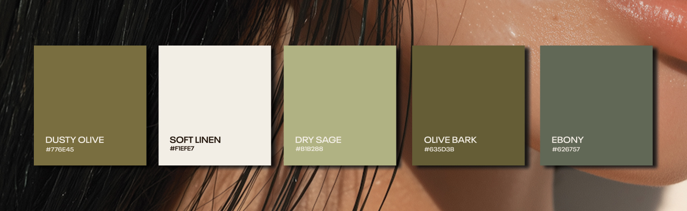
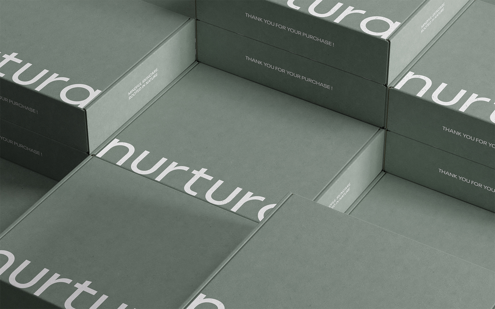
My vision for Nurtura was to build a brand rooted in calmness, purity, and natural nourishment. Light, soft colours were chosen to communicate a sense of peace and clarity, supporting the idea that the products are gentle, botanical, and free from unnecessary additives. Every design choice from the colour palette to the typography focuses on creating a soothing experience that reflects the purity of the ingredients inside.
PROCESS
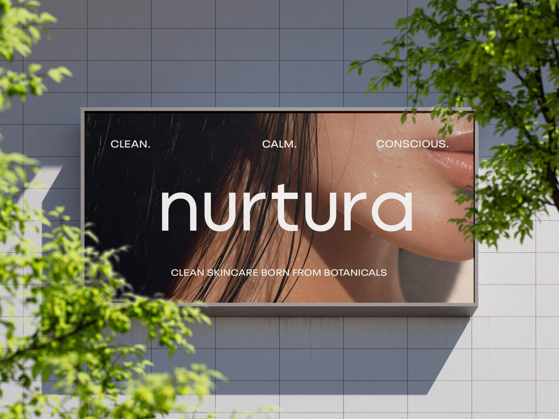
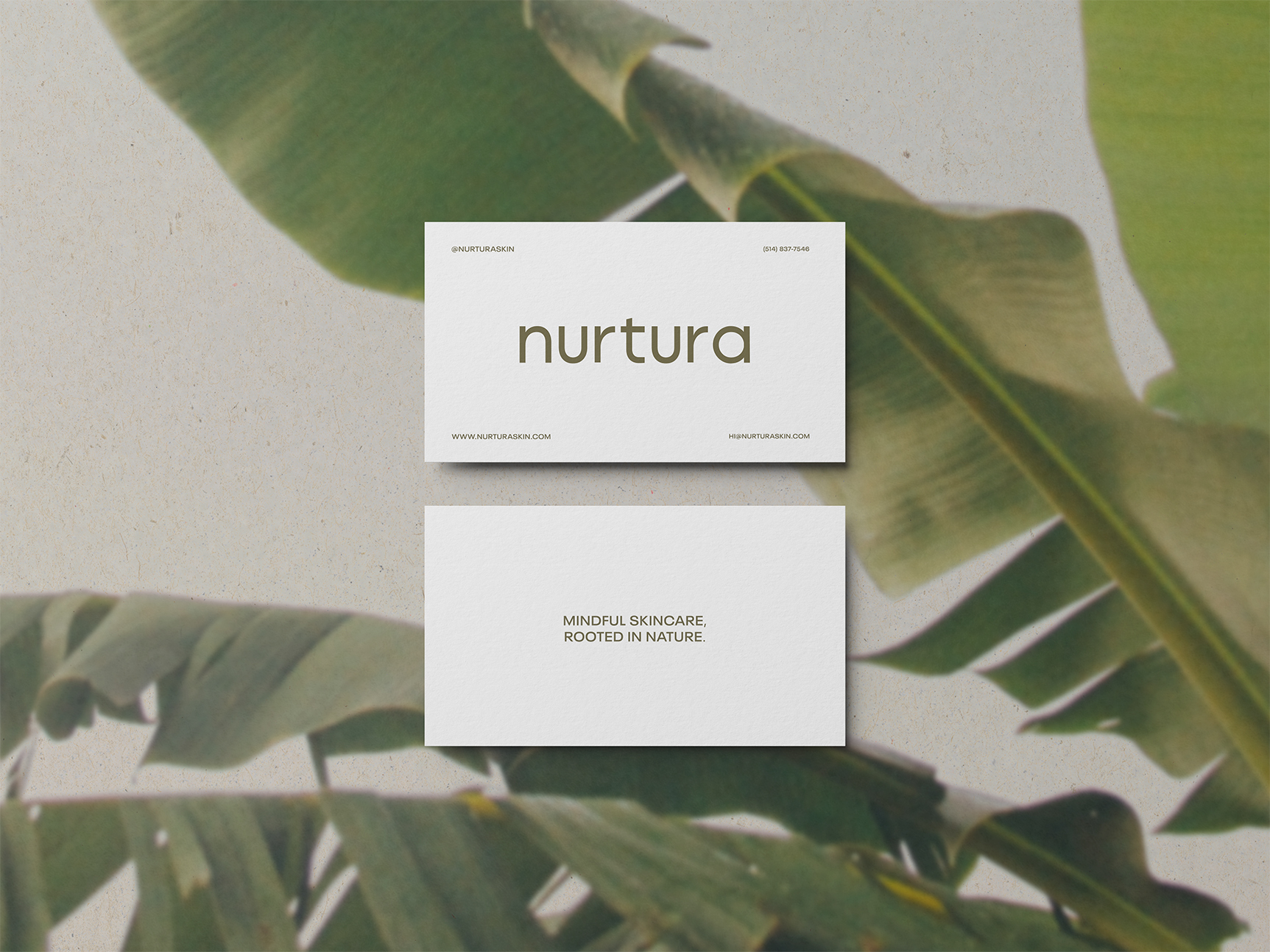
I approached the design with a clean and minimalist mindset. The logo features a simple, modern sans-serif typeface with straight, intentional lines, reinforcing transparency and honesty. This minimalism extends across all packaging elements: the bottles and boxes clearly communicate the product type and key botanical ingredients without visual clutter.
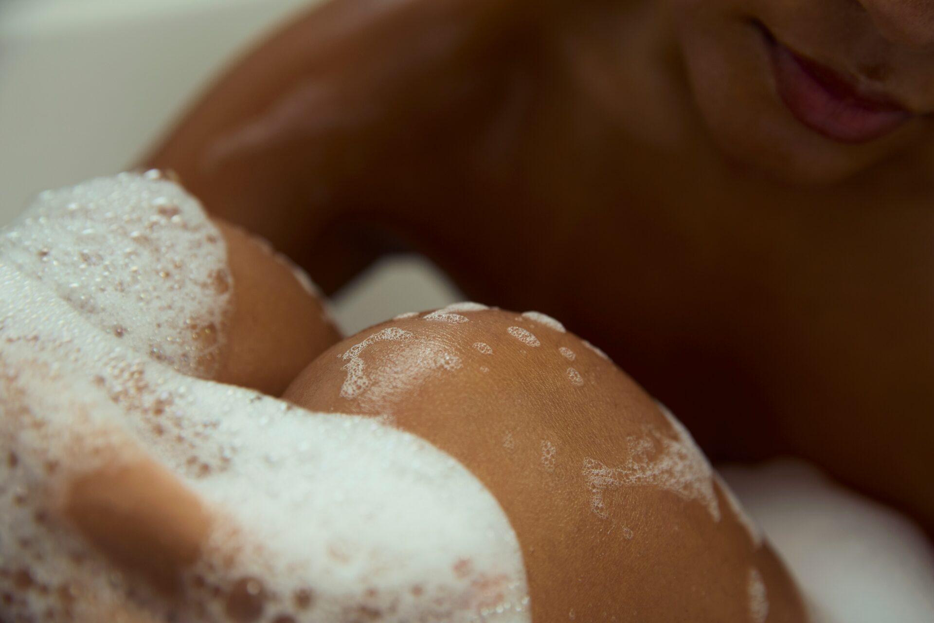
The product formulations inspired the design direction as well; each item highlights natural botanicals, which guided my approach to the labels, copywriting, and overall tone. Soft, airy colours and simple structure help the packaging feel gentle, refined, and grounded in nature.
OUTCOME
The final brand features a cohesive line of skincare essentials, including a hydrating body wash, gentle face cleanser, lightweight body lotion, nourishing body oil, and additional botanical-based treatments. The collection feels clean, calming, and modern, with all products visually connected through consistent colours and minimalistic layouts.
Nurtura successfully communicates purity and nature-driven simplicity, resulting in a brand that feels both luxurious and approachable.
TAKEAWAYS
This project strengthened my ability to design for the clean-beauty market, where simplicity and trust are essential. I learned how to use colour, typography, and packaging structure to communicate purity and botanical freshness. Overall, Nurtura taught me how effective minimal design can be when paired with a clear, ingredient-focused brand message.