Muse is a perfume brand developed for a group design project, built around the idea of helping individuals “find their muse” through scent. My team and I initiated the naming process, aiming for a word that felt elegant, memorable, and aligned with creativity and self-expression. Muse captured the essence perfectly: a name that reflects individuality, inspiration, and the personal connection people have with fragrance. Paired with the tagline “Find your Muse,” the brand invites users to discover a scent that resonates deeply with their identity.
VISION
From the beginning, the vision was to craft a brand that felt organic, minimal, and sophisticated. We wanted Muse to embody calm simplicity while still suggesting emotion and creativity. The visual identity needed to feel approachable yet refined, with a focus on clean lines, gentle shapes, and a soft aesthetic. Everything from the naming to the scents themselves was guided by the idea of purity, individuality, and inspiration.
PROCESS
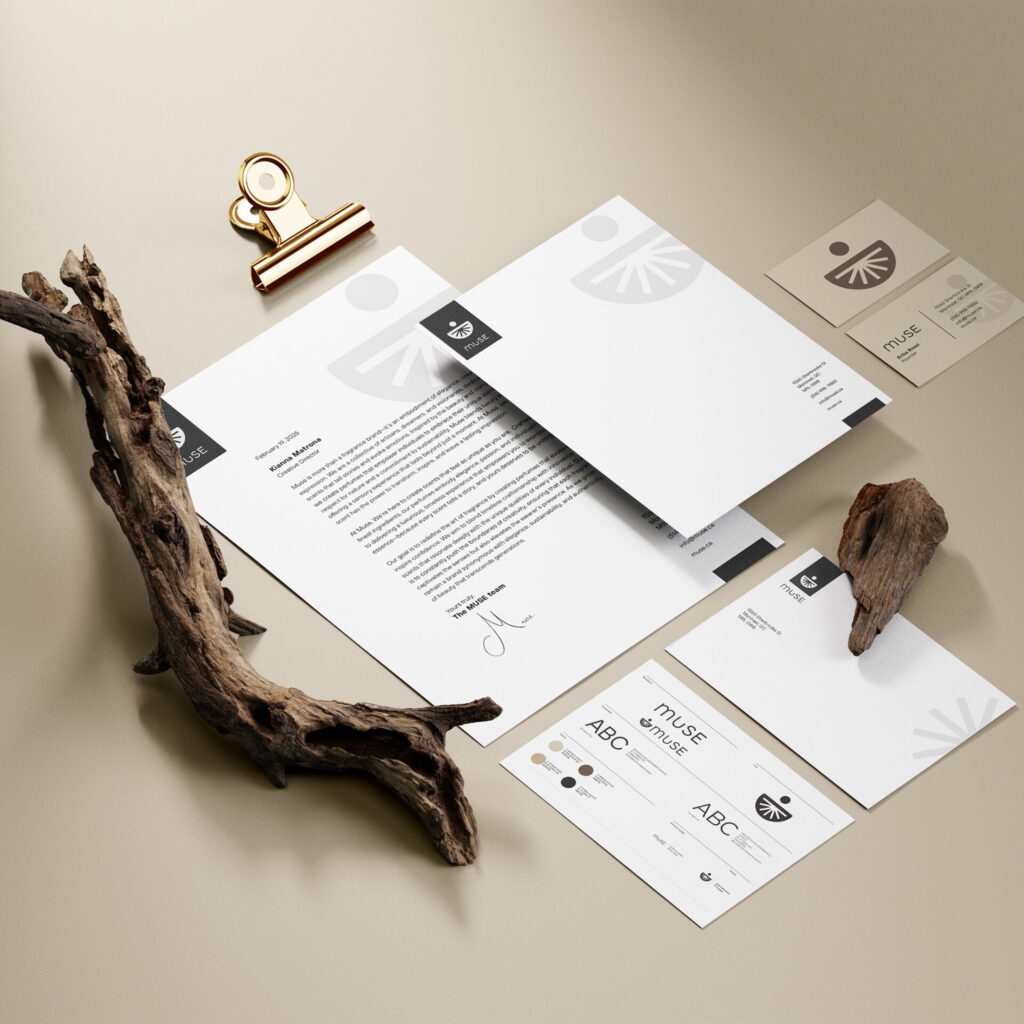
To develop the brand identity, we researched existing perfume brands to understand the visual language of the industry. We noticed that many successful brands used minimal, understated design elements, which inspired our own direction. Our logo was designed to feel rounded, simple, and organic, but it also includes subtle conceptual details. The dip in the letter “U” represents the motion of pressing down on a perfume spray, creating a visual metaphor for the act of applying fragrance.
Our icon reflects the shape of a perfume bottle, and the lines extending from it symbolize the mist of the spray releasing into the air. From there, we built a cohesive system across all brand materials, including business cards, labels, boxes, and stickers. We kept the color palette neutral and consistent, and each label included only essential information: the signature “M,” the scent name, and the scent number.
OUTCOME
The final brand is clean, modern, and highly cohesive. Every touchpoint reflects the same simplicity and elegance. The packaging is minimal and purposeful, allowing the logo and scent details to stand out. Our fragrance collection followed the same philosophy: a selection of balanced scents some floral and some warm offering something for everyone. The overall result is a brand that feels calm, intentional, and connected to the idea of personal inspiration.
Together, these elements create a unified brand experience that feels both memorable and emotionally meaningful to the customer.
TAKEAWAYS
Through this project, I learned the importance of consistency and clarity in brand identity. Developing Muse reinforced how effective minimal design can be when it’s supported by thoughtful research and a strong conceptual foundation. I also gained experience in collaborative decision-making, visual cohesion, and translating a creative idea into a full, functional brand. Ultimately, Muse taught me how branding can help people connect emotionally with a product and with themselves.